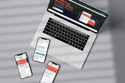
Zest
A UI-focused project completed as part of my Professional Certificate in UI Design, delivering a multi-platform banking app designed to feel playful, clear, and trustworthy.
Focused on colour hierarchy, content prioritisation, and minimalistic layouts to highlight essential information on each screen.
Ensured responsive design across devices, maintaining legibility, intuitive interactions, and consistent affordances.
.png)
Overview
Objectives
-
Design a responsive banking app across mobile, tablet, and desktop
-
Create a design system (typographic styles, component system, and iconography)
-
Balance a playful aesthetic with the seriousness of financial content to ensure trust and POD
Audience Background
The target audience included digitally literate users who expect banking to be intuitive, transparent, and visually engaging. Many are familiar with mobile-first experiences through apps like Monzo or Revolut, and expect real-time insights, clear financial summaries, and a sense of control over their money.
While some users seek playful, modern interfaces, the underlying need for security and clarity remains non-negotiable. The app should appeal to users who want their finances to feel less overwhelming without compromising on professionalism or trust.
Constraints
-
Align with common UX patterns in existing banking apps to avoid usability friction.
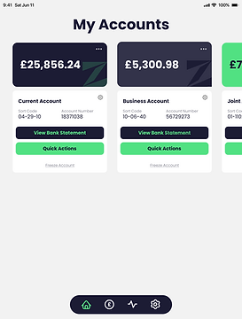
Deliver three core screens per device:
-
My Accounts
-
Current Account
-
My Spending
Software:


Research
Concept Board
-
Through my exploration, I found using one colour as a highlight throughout the colour palette can bring the playfulness while helping to make information clear.
-
I was drawn towards using green for the primary because of the connotations with money and the large contrast for dark colours.
-
My initial look at fonts made me consider the route of serif versus sans-serif. Due to this being a modern take on banking, I was leaning towards sans-serif to evoke a sense of accessibility and trustworthy without the overwhelmingness that people feel surrounding banking platforms.

My concept board explored competitors use of colour, typography, fonts and illustrations.
Competitor Research
-
When browsing for phones, users face up to three pages of products. Page one receives 135% more views than page two, indicating that products buried deeper in pagination are rarely seen.
-
Filters below the first visible section were rarely used, suggesting low visibility or relevance.
-
Most purchases followed targeted campaigns, reinforcing that users value curated, trusted recommendations and respond well to guided discovery.
Some of the competitors I looked at include Monzo and Revolut.
Component Research
-
I could clearly see where branding would be applicable across components through use of colour and consistency in shape and line weight.
-
I looked at designs from various platforms such as Pinterest, Dribbble and Behance. I aimed to look at a variety of types of components to get a broad overview of the various routes I could take.

The moodboard I used to collate my visual research.
Colour Research
-
I chose some of the examples from my research that fit the brief best and created a colour palette for each design. My key learnings from doing this was how each design used a dark tint from their primary colour to be their text as well as an off-white colour for the background.
-
I noticed how the dark colour next to a primary bright colour works very well for contrast and readability. It was also interesting to see the use of the off-white tint next to white to create the structure of cards discreetly.

I created the colour palettes of each design and noted the tints used.
Typographic Research
-
For my font research, it was important to look at both the traditional banks branding as well as the new online banks.
-
Traditional brands such as HSBC and Santander use a light-weight type as their primary, while brands that want to be portrayed as modern such as Barclays and Monzo use a bold type for their headings as a statement.

Breaking down the styling for headings and paragraphs for a variety of competitors.
Icon Research
-
The icons need to be simple but recognisable so they are legible on a small mobile screen as well as a larger desktop.
-
It's important to use the conventional icons so that they are recognisable but by doing mall adaptations I can add playfulness and brand voice.
-
While I really like the use of tints in the top middle icon set, legibility and accessibility is more important. Using bold colours so that all elements of the icon are comprehensive will be priority over aesthetics.

Looking at different styles of icons and the use of colour.
Key Research Findings

Use a bold colour as primary with a high contast to the secondary dark colour and a light tint as background.

Make use of white space and light tints to create structure and hierarchy.

Use a sans-serif font for modernity as well as portrayal as trustworthy
and transparent.
Ideation
Text Styling
-
Before exploring the visual design, I defined the text size across devices to ensure consistency and accessibility.
Sketching and lo-fi


-
I created the styles in Figma so it would be quicker and easier to adapt designs across screen sizes.
-
Referring back to research, I noted which key information was needed for each screen and began to sketch how these sections could be portrayed.
-
I started one screen at a time and sketched cards to see how they could be resized across devices.
-
Once the most effective layout was determined, I translated these initial concepts into low-fidelity wireframes using Figma.


I used Procreate on an iPad for the sketches and built the lo-fi in Figma.
Development
Component Iterations
-
Once the first version of the structure was mapped out, I began iterating each component.
-
I started by looking at the the shapes within the component and how I can use colour to develop a playful yet professional feel. Due to my earlier research I had a valuable resource to refer back to.

Exploration with colour, layout and sizes.


Solution
Hi-fi wireframes
-
My final high-fidelity wireframes were designed with progressive disclosure in mind, revealing more information as the screen size increases.
-
By leveraging text styles and Figma’s auto-layout feature, I was able to efficiently adapt components across mobile, tablet, and desktop breakpoints making responsive adjustments seamless and consistent.

Mobile


Tablet


Desktop


Accessibility testing
-
I used the Figma plugin Contrast to test the accessibility of my designs. While the primary and secondary text met accessibility standards, the tertiary text did not pass due to insufficient contrast caused by its weight and colour.
-
This highlighted a key takeaway from the project: the importance of conducting accessibility testing consistently throughout the design process to ensure inclusive and user-friendly experiences.

Learning Outcomes
Key Takeaways
The biggest challenge in this project was finding the right balance between the seriousness of the subject matter and a playful, engaging design approach. While I believe this was achieved I would like to pursue taking it further by exploring the brand’s tone more deeply through thoughtful transitions, microcopy, and communication strategies to bring even more personality and cohesion to the experience.
What to take to the next project
This project has reinforced the importance of designing with intention, accessibility, and user expectations in mind from the very beginning. Moving forward, I’ll prioritise accessibility checks throughout the design process to ensure a more inclusive experience for all users.
I’ve also gained a deeper appreciation for the role of visual research and tone in shaping user perception. By grounding future projects in well-defined brand attributes and user mental models, I’ll be better equipped to create interfaces that are not only functional but emotionally resonant and on-brand.