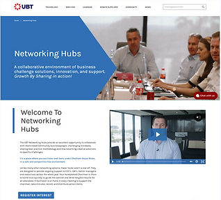
Networking Hubs
This case study examines a paid product that connects business professionals through moderated peer groups for problem-solving and networking.
Low engagement and sign-up rates revealed unclear differentiation from other offerings and limited understanding of how the product worked and the available Hub types.
The work clarified the value proposition, improved product understanding, and better communicated Hub options, resulting in increased engagement and sign-ups.

Overview
Objectives
-
Clarify the product offering by clearly communicating how it works, who it’s for, and the value it provides.
-
Increase sign-ups by clearly differentiating the product’s USPs from adjacent offerings.
-
Improve engagement and confidence during sign-up by simplifying the structure and presentation of Hub types.
Audience Background
UBT serves members of the Plymouth Brethren Christian Church, a closed Community that primarily engages with internal media, shops through affiliated businesses, and places strong trust in UBT’s guidance and recommendations.
Given this context, the design challenge extended beyond promoting USPs or networking opportunities, and instead focused on appealing to members at different career stages, clearly demonstrating how the product could support each group in distinct ways.
Constraints
-
Evolving product definition meant working with limited initial information and adapting to late-stage changes as the product continued to be refined.
-
Minimal existing content required rapid development of clear, concise messaging to explain a complex product within a single page experience.
Software:


Results
Revenue Impact
First 24 hours post-launch generated £4k in sign-ups, with additional conversions in the first week.
User Journeys
Visitors navigate as intended, from homepage to Hubs or via external links, with clear context to sign up.
Reduced sign-up form completion time by 72%, from 1m 16s to 21s.
Scalable Design
Successful structure adopted for rollout in other regions; ongoing testing informs further improvements.
Research
Competitor Research
-
Competitor analysis revealed a consistent page structure across comparable products. Aligning with this pattern supports user expectations and leverages existing mental models, enabling the product to compete more effectively within the market.
-
Several competitors prominently featured a named contact or representative, introducing a human element to the experience. This approach reinforces trust and reflects the relational nature of a networking product, where personal connection is a key motivator.

Competitors analysed include similar products in the same location, independent companies and top of the industry.
Existing asset analysis
-
The existing pages contained limited content, but significant usability issues were identified on mobile, including layout inconsistencies that negatively impacted the experience.
-
The final sign-up step presented a major friction point, requiring approximately 10 touchpoints and taking over a minute to complete. The heavy reliance on text inputs, combined with a lack of placeholder or helper text, increased cognitive load at a critical conversion moment.

I worked with the marketing team to create a dashboard showing the key data from GA highlighting key information.
Video analytics from webpage
-
The primary source of product information is a video positioned above the fold, making it a key entry point for users. However, mobile viewership was approximately 90% lower than desktop, reinforcing existing mobile compatibility issues.
-
Despite being over two years old, the videos received higher view counts this year than last, suggesting renewed or growing interest in the product and reinforcing the importance of video as a key communication channel.

Using Wistia's analytics to view engagement, drop-offs, device type and views.
Focus groups
-
Many insights related to the post-purchase experience; however, as this sprint focused on the pre-purchase journey, these findings were documented for future consideration rather than addressed in this phase.
-
Correct group placement emerged as a recurring concern, with a lack of transparency around how groups are formed creating hesitation and acting as a barrier to conversion.
Online survey
-
Qualitative data from an online survey conducted by the marketing team revealed significant product confusion, with respondents frequently mistaking this offering for another company product. Additionally, only 10.2% of respondents perceived the pricing as appropriate, indicating a mismatch between perceived value and cost.
-
No single dominant usage pattern emerged, highlighting that the product delivers value in different ways depending on users’ industry and career stage — reinforcing the need for clearer segmentation and tailored messaging.

Statistics from the Microsoft Forms survey. Why do you complete the hubs (top) how much do you think the product should cost (left) how should the Hubs be grouped (right).
Google Analytics
-
Analysis of GA4 data and the marketing dashboard revealed a clear spike in page visits following the weekly newsletter featuring a video testimonial. This highlighted the value of testimonials, which were previously positioned low on the page despite their importance.
-
Engagement rates were high (96.97%), with 155 active users across 191 sessions, indicating that most visitors were first-time users. This suggests strong initial interest but limited content encouraging return visits.

The analytics gathered from GA4 and Looker Studio dashboard.
Hotjar
-
Analysis of scroll depth, clicks, and cursor movement revealed which elements captured the most user attention and interaction.
-
Testimonials, the third most-clicked element, were only seen by 30% of users, indicating the need to move them higher on the page for greater visibility.
-
Users frequently clicked on images of individual Hubs, despite there being no links, highlighting strong interest in learning more about both the product and specific Hub options.


Using Hotjar to look at screen recordings and behaviour on the existing page.
Key Research Findings

Product clarity is low: Users struggle to quickly understand what the product is, its value, and how it works.

User journey is unclear: There is no guided path for visitors to explore the product before committing, creating friction in the sign-up process.

Differentiation is weak: The product’s USPs versus adjacent offerings are not communicated clearly, reducing conversion motivation.

Critical content and trust signals are underutilised: Important elements such as testimonials, Hub information, and human connections are either placed poorly.
Ideation
User Journey
-
I created a user journey to map key entry points and structure the information users need at different stages of their website experience. With no initial structure in place, this was critical to help the marketing team develop copy before progressing to webpage design.
-
Insights from various research sources were synthesised using sticky notes, colour-coded to highlight positive experiences, pain points, and mental model observations.

User journey map on Miro that identified the key structure needed for the content of the product webpage.
Content plan
-
Interpreting the findings from the user journey, I created a structure plan which I handed over to the marketing and content team.
-
Each point of content was backed up with research so that we were only providing the information that the users needed to know to reduce a sense of overwhelm for a product that was complex.
The key points of structure were:
-
What is the product and why should I buy it?
-
What do other people think?
-
How does it work and what groups are there?
-
How much does it cost?
-
How is the day structured?
-
Who can I talk to to learn more?
-
Register Interest
Lo-fi wireframes
-
I translated early sketches into lo-fi wireframes, exploring layout options and information visualisation to support clearer product understanding.
-
The journey then expanded into dedicated pages for each Hub type, outlining who each Hub is for, what participants will learn, and incorporating testimonials to build credibility.
-
Throughout the experience, the design consistently surfaced clear next steps, guiding users towards sign-up or deeper exploration at each stage of the journey.
-
Each page incorporates a contact form supported by imagery of the person responding, introducing a human touch at key decision points. This approach was informed by competitor research and used to build trust and reduce hesitation at the point of contact.


Hi-fi prototype
-
Following stakeholder approval and updated copy from the marketing and content teams, the lo-fi wireframes were signed off and developed into hi-fi designs.
-
The hi-fi stage focused on strengthening stakeholder buy-in and exploring the application of the brand across the experience.
-
Due to the structure of five of the pages being the same to create a consistent experience across the product, only one page was developed into hi-fi to save time and be more efficient.
-
A clickable prototype was not required in this instance, as the experience contained no complex interactions within the constraints of the existing brand.


Form design
-
Reduced sign-up completion time by 72%, from 1m 16s to 21s.
-
Used a smartsheet autofill URL for each individual Hub to reduce time taken it give tailored experience.


The sign up form after clicking on the website. Before (left) after (right)
Tailoring for Different Career Stages
-
Early-career professionals can explore networking Hubs to gain confidence, learn from experts, and make valuable connections, while late-career users are guided toward mentoring opportunities to share knowledge, solve challenges, and give back to the community.
-
To address the needs of multiple audiences, the homepage includes a tabbed section that surfaces relevant benefits based on career stage.

-
This approach ensures the product communicates value clearly and personally for each user segment.
Tabs to select your business profile and learn the tailored reasons to sign up as well as recommendations for specific hubs to encourage continuation of the journey.
Testing
AB Testing
-
Before launch, I conducted A/B testing on the old versus new website using a Magento 2 plug-in, exposing 50% of users to the redesigned site over seven days.
-
The test demonstrated increased engagement and three additional sign-ups on the new version. Insights from the test informed the ordering and prioritisation of Hub types, making the most popular options easier and quicker for users to find.

Showing the old webpage (left) versus the new webpages (right) which were AB tested 50/50. Resulting in increased engagement and signups for the new design.
Results and Development
-
The redesigned product experience launched alongside a marketing campaign via the weekly newsletter, linking users directly to the new homepage.
-
Within the first 24 hours, the redesign generated a sign-up equating to £4k in revenue, with three additional sign-ups within the first week. User journeys indicate that the homepage is functioning as intended: visitors are navigating to Hubs from the homepage or arriving via external links, and they are provided with sufficient context to enquire or sign up.
-
Ongoing data collection will inform further optimisation of the page. Due to the success of this redesign, the company has decided to adopt the same structure in other regions.
Revenue Impact – First 24 hours generated £4k in sign-ups, with additional conversions in the first week.
User Journeys – Visitors navigate as intended, from homepage to Hubs or via external links, with clear context to sign up.
Scalable Design – Successful structure adopted for rollout in other regions; ongoing testing informs further improvements.
Learning Outcomes
Challenges
Designing for multiple audiences with differing needs required careful consideration to ensure the experience felt relevant and intuitive for each segment. Balancing stakeholder requirements, branding constraints, and minimalistic layouts added complexity to decisions around content hierarchy and interaction design. Additionally, creating a clear, multi-page journey while encouraging engagement and sign-ups demanded iterative testing and refinement.
What to take to the next project
This project reinforced the importance of tailoring experiences to distinct user segments and using testing insights to prioritise content and interactions. It strengthened my approach to applying brand consistently in high-fidelity designs while aligning with stakeholder goals.
Moving forward, I will continue to focus on designing intuitive user journeys that support business objectives and deliver measurable impact.