
A desktop hotel booking experience, designed to reduce user friction and increase booking success rates.
This project was completed for my Diploma in UX design and was rooted in the structured UX process and focused on removing confusion, building trust, and simplifying the booking flow for a wide range of user types.
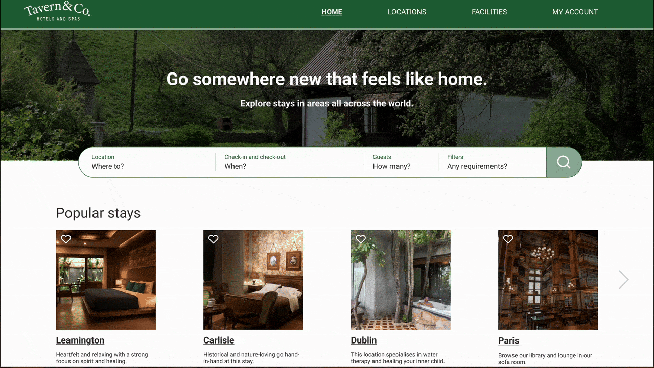
View the hi-fi prototype
Tavern&Co.
Overview
Objectives
-
Understand user needs and pain points: Identify what users find confusing, frustrating, or time-consuming when booking a hotel.
-
Simplify and streamline the booking flow: Reduce cognitive load by removing unnecessary steps or unclear interface elements in the booking process.
Constraints
-
Market differentiation: Standing out in a saturated space (Expedia, Booking.com, Airbnb) while solving pain points they still haven’t addressed.
-
Varied user needs: Balancing a streamlined booking experience for the majority of users, while still catering for edge cases and unique preferences.
-
Decision fatigue: Reducing the number of steps without removing important options or oversimplifying the process.
Audience Background
Hotel booking is a common digital task, but often comes with friction: overwhelming choice, unclear pricing, and lack of trust.
With increasing expectations for transparency, speed, and usability, creating a simplified booking process became a strong opportunity.
This project reimagined the booking journey to be more intuitive, with a focus on improving the end-to-end flow from search to confirmation. It aimed to reduce confusion, shorten decision time, and support user confidence through clearer UX.
Software:


Research
-
Consistent homepage search bar structure.
-
Inconsistent booking steps (e.g. unpredictable placement of add-ons like breakfast).
-
Pricing often unclear or broken across stages.
-
Visual confusion in date selection (unclear if user is editing check-in or check-out).
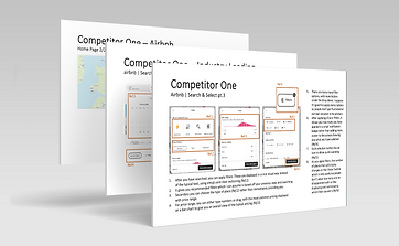
Competitive Benchmarking
.png)
Online Survey
-
Users tolerate more content if it's useful (e.g. Booking.com preferred despite design being "busy").
-
60% book on laptop.
-
No clear winner for most important factor: price, location, and ratings all ranked similarly.
-
Several participants preferred a “less cluttered” search results page.
-
No one books less than a week in advance.

I used Microsoft forms for my online survey
Usability Tests
I conducted two usability tests using Microsoft Teams. I asked each participant to complete a scenario on two hotel websites: Limewood hotel, an independent nature-focused hotel and Best Western, a familiar affordable chain of hotels across the UK.
UI & Visual Hierarchy Issues
-
Poor button placement and visibility
-
Misleading wording (e.g. “Add double bed” unclear)
-
Lack of proper loading indicators led to uncertainty.
Filters and Personalisation Gaps
-
Lack of filtering by room type or breakfast inclusion
-
Users had to scroll excessively instead of scan visually
-
Visual hierarchy made it hard to compare options at a glance.
UI Mismatches
-
Dots for photo carousel misunderstood or ignored
-
Checkout auto-opted users into loyalty programmes = reduced trust
-
Reward programme felt like a trick,
eroding brand credibility.
Booking Flow Confusion
-
No obvious “next step” after room selection
-
Actions like “See All Rates” or “Book Now” unclear on what will happen next
-
Repeated rate types without explanations
led to distrust and confusion.
Missing Contextual Info
-
No map/location reference for hotel listings
-
Users wanted to see pricing on calendar to compare flexible dates
-
Dining options often required a callback, this is unacceptable to users who want full online control.
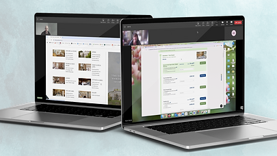
I used Teams to conduct the usability tests, recording for detailed notes later.

I made detailed notes on Word and highlighted whether each action was positive or negative.
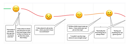
"I like when it shows you the price so you can kind of get a feel of like is it better to go like this week, this Friday [about calendar view when entering dates]."
"Normally the first thing I do is always filter."
Some quotes from the usability tests.
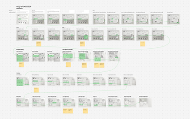
Affinity Map
I worked with another UX designer to create this diagram by combining our research and sorting the cards together. Some of the main categories identified from sorting the notes into an affinity diagram include:
Map
-
Positive: liking the map and seeing some hotel information on it.
-
Negative: being unable to find the map feature.
Search
-
Positive: search bar staying at the top when scrolling.
-
Negative: search bar not working universally, having to insert the hotel name.
Customer Journey
-
Positive: being able to look through options before entering your search parameters.
-
Negative: can't find CTAs - the next step
being unclear.
Accessibility
-
Positive: having icons in the highlight section for a quick overview of hotel.
-
Negative: page jumping when trying to edit dates, confusing or duplicate naming conventions, too much on the page or distracting pop-ups.
Homepage
-
Positive: well organised with clear sections.
-
Negative: being taken to a sponsored location from browser search so it's not the main homepage.

Myself and my partner used Miro to create the affinity diagram.


Each note was colour coded and referenced where the research came from.
Customer Journey Map
-
Package Selection
Confusion arose when choosing between similar-looking room packages with unclear differences or benefits.
The journey revealed key friction points at three critical interaction stages:
-
Date Selection
Users struggled to confidently edit
check-in/check-out dates due to
unclear selections.
-
Add-ons
The process of selecting extras (e.g. breakfast) felt disconnected, often introduced too late or without clear pricing context.
In contrast, users responded positively to:
-
Initial Visit & Search
The homepage experience was intuitive
and gave users immediate confidence to begin their booking.
-
Payment Flow
Once through the selection phase,
the checkout and payment process
was straightforward.
-
Hotel Imagery Exploration
Browsing photos helped users build trust
and imagine themselves at the property.

I used Miro to create the customer journey map, duplicating the affinity diagram notes.

Each point was backed up with research mapped on the affinity diagram. I tracked the emotions at each stage based on quotes from usability tests.
Key Research Findings

Users value detailed information and transparency, but feel overwhelmbed by cluttered interfaces and unclear pricing.

Confusion around package options, calendar inputs, and add-ons frequently led to frustration and booking delays.

Users need to be able to find the contextual information easily e.g. breakfast included - what breakfast or for
a hotel in London - transport links.

Users want to be able to filter easily and clearly. There should be all the options they might need.
Ideation
Flow Diagram
Going through five iterations, this exercise defined the screen states and interactions of the 'happy path'.
While this was lengthy to design, due to the large number of inputs from the user, this helped the sketching stage significantly by visualising the interactions and outlining key elements needed on each screen.


This was created on Miro. The key stages were colour coded with the key steps chunked further with titles.
Sketching and Interaction Design
Since this project was for my Certificate in UX Design, it was required to sketch out each screen in detail including the copy.
While this process took a long time, it certainly helped make the design of the prototype much easier.
The sketches are detailed with annotations and highlights the key path the user will take. This was done on Figma.


Prototype
Hi-fi Figma Prototype
I created the hi-fi prototype on Figma by creating my own components and variants to test my skills.
I mapped out the key interactions for the 'happy path' showing hover states and clicked states.

Annotations
For handover documentation, I used Figma comments to detail the key aspects of the interactions.
I found this interesting to do since I had become so familiar with the design. It was challenging to think of it from an outside perspective and comment on the aspects I knew so well myself.

Learning Outcomes
Key Takeaways
Working on this project as part of my Certificate in UX Design has allowed me to solidify my knowledge into a tangible qualification for the next step in my career. I've also realised that even industry leaders like Airbnb and Booking.com have room for improvement through continuous testing and iteration. Design is not a lineal process.
What to take to the next project
This project reinforced the key stages that should be taken with product design. By having the time to delve into the details and take my time with a project, I was able to solidify my knowledge and move forward with a clear framework I will take into future projects.